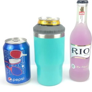
Description
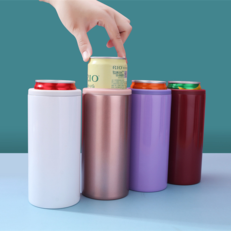
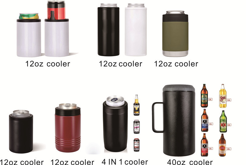
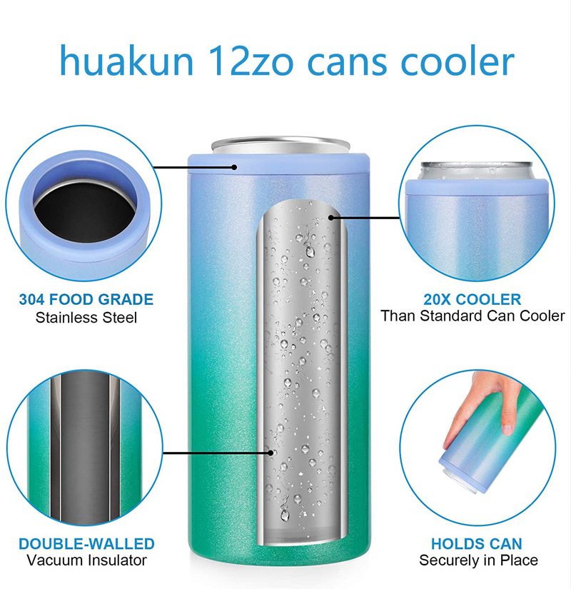
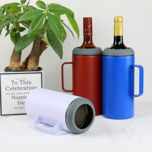
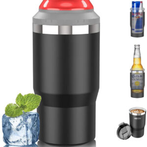
12oz Beer Can Cooler
Beer has a narrow temperature window
Beer is at its best between four and eight degrees Celsius. Above ten it reads as flat and sweet; below two the aroma shuts down and the carbonation stings. A can cooler exists to hold that window, not to make the beer colder, and that distinction determines the entire design.
A cooler that over-insulates keeps the can at its starting temperature, which is fine. A cooler that is opened constantly loses the cold air each time and has to recover, which is why the opening mechanism matters more than the wall thickness.
Fit is the primary specification
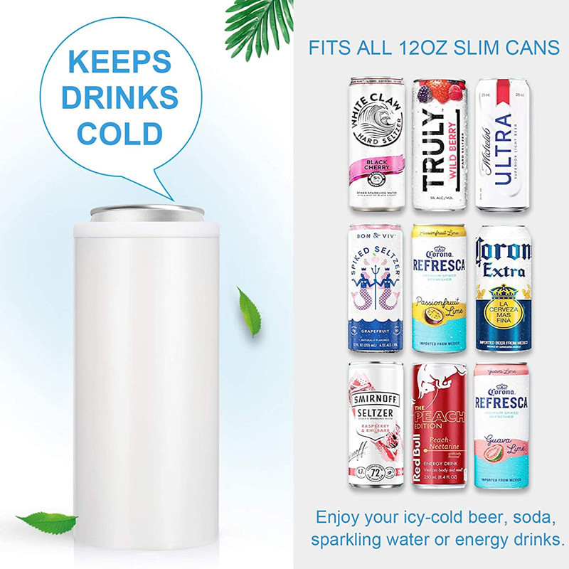
A standard 12oz can is 66mm in diameter and 122mm tall, with a slight taper at the top and bottom. A cooler bore that is 67mm allows the can to be inserted easily and still held by friction. A bore at 68mm lets the can rattle; a bore at 65mm means the user cannot get the can in without forcing it, and forcing it scratches the can and the liner.
Measure the actual cans the target market uses, not the nominal standard. Can diameters vary by a millimetre between fillers, and a cooler designed to the tight end of the tolerance will reject some cans.
Condensation and the base
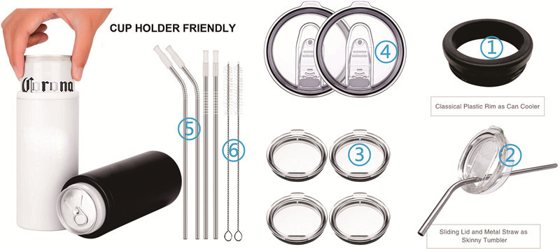
A cold can in a warm room condenses heavily. If the cooler does not seal at the rim, water runs down the outside and pools on whatever the cooler stands on. A silicone base ring solves the puddle; a lid with a gasket solves the source.
Most coolers omit the lid because it slows drinking. That is a defensible trade as long as the base is designed to contain the water that will inevitably appear.
Liner material and taste transfer
The liner touches the can, not the beer, so taste transfer is minimal. What matters is that the liner does not scratch the can’s coating and does not retain odors from previous use. EVA foam is common, cheap, and retains smell. A molded TPU liner costs more and rinses clean.
Branding on a cylinder
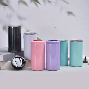
The printable area on a cooler is a narrow band, and it curves in two directions. A wrap-around print works; a large single logo does not, because it distorts at the edges. Plan artwork as a repeating band rather than a centered mark, and the product will look intentional rather than constrained.